Last week we got a chance to visit the CSAD degree show. The exhibition provided a wide variety of work to look at and displayed engaging pieces of work from all of the art school. Going into the exhibition, i wasn’t sure what to expect in terms of layout and how easy it would be to discover where different parts were. The exhibition was really insightful ad it was interesting to see what the 3rd year Graphics students had been getting up to. It was interesting to see how different subjects had chosen to display their work and their different interpretations of using the space provided. The work was engaging and some on the pieces stood out to me much more then others.
The yes show!
Lucie De Maid – The Coconut Grove
The First piece of work that caught my eye was ‘The Coconut Grove’ project by Lucie De Maid. It stood out to me because it was clear and bold. I really liked the colours used in the piece, i feel like they are relevant to the work and make the piece look tropical and vibrant. The pattern used on the poster was very eye catching and also stuck with a similar tropical theme, providing a very contemporary style in their. I think that this work was laid out really well in the space given, showing you all aspects of the project and outcomes they produced.

Isabella Walker – Alchemy Festival
The second piece that i really liked was the ‘Alchemy Festival’ project by Isabella Walker. There was a clear consistency in her work with a very clear hierarchy and path for the eye on all of her posters, making them very easy to read and visually pleasing to look at. I really like the use of patterns in this work, it grabs your attention but doesn’t draw away from the main idea of the piece. The work is very contemporary and gives of a professional feel. The layout was well considered, each poster had their wristband next to it which i thought was well thought out and it was interesting to see that even though there were so many elements in this space that it didn’t look crowded.

Natasha Seaward – ONE | FITS | ALL
I really liked this piece because it was different to all the other projects that caught my eye. The clever imagery and posters used in this project really sell what its about. I also really like the idea of gender less cosmetics, as it promotes people to be the best version of themselves rather then covering up flaws, using makeup as a forward way of thinking. I also really liked the display of this piece, the make up on the desk made the project much more realistic and believable and everything fitted within a very neutral colour theme which i thought worked really well.


Callum Richards – Printed Words
I also really liked this piece by Callum Richards because it was bold and really stood out. The images were clear and the whole piece looked really professional in the way that its designed, printed and laid out. All of the carefully considered elements provide pace within the work and a clear hierarchy across the piece. This project feel very contemporary, making the most of a basic but bold colour scheme to emphasise certain aspects of the work. The presentation of the work looks very mature and sophisticated and i liked the fact that there were examples that you could pick up and look at because this made it a lot more engaging.


I was really impressed with the yes show and the range of work it had to offer. The exhibition made good use of the space and each individual project stood out in its own way.
However, compared to some of the other exhibitions, i think that the yes show could have been laid out a bit better. For example it would have been nice if the work could have been displayed in a continuous loop like the textiles show, this way there was enough room to move around and you didn’t miss anything. I found that because the work was displayed around the edges and on individual islands in the middle of the room it made it difficult to move around and not miss any of the pieces of work, especially when the exhibition was really busy. Another thing i noticed was that when you came in one way to the exhibition there were no signs telling you what you were looking at (or they weren’t noticeable). Also i found that a lot of the projects seemed repetitive (which cant be helped) because they were all in a poster format and didn’t really explore other ways of displaying work, where as the illustration exhibition included all kinds of different work and style of working which made it slightly more engaging.
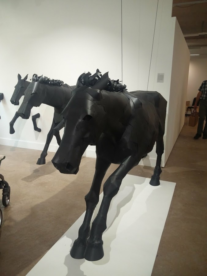
Hannah Taylor
One of my favorite projects was Hannah Taylor’s horse project. I found this piece of work fascinating because it was so big and bold and also really well put together. What made this piece even more intriguing was that they were made out of card, yet they held their shape really well and included a lot of detail. I also liked the fact that her exhibition showed a step by step progression of her work, showing development in her design and detail. One of the main reasons why i love this piece is because owning horses myself, i felt a connection with how dramatic and powerful the horse was portrayed and i feel like it really captured the beauty and boldness of horses and captured their powerful movements in such a delicate and time consuming way. Overall i feel like this exhibition and project were put together really well and i thought that her presentation made good use of the space provided.